
The crest

News article on: Symbols
The crest
There are few elements that symbolise an organised group more than its crest.
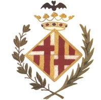
From the very moment Barça was founded, the club had its own emblem that the players proudly wore
on their shirts. It was the coat of arms of the city of Barcelona, a diamond shape divided into
four quarters, with a crown and a bat on top, and surrounded by two branches, one of a laurel tree
and the other a palm. This, even at such an early stage, was a way of expressing the club’s
link to the city in which it was born.
This crest remained unchanged until 1910. Shortly after Gamper had saved the club from
serious crisis in 1908, a decision was made to give the club its own differentiated crest. In 1910,
the club held a competition between all the members interested in presenting proposals. The winner
was Carles Comamala, who played for the club between 1903 and 1912, and was a medicine student at
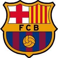
the time, as well as being a fine artist. And so the crest that the club wears to this day was
created, although there have been a few variations. It is a bowl-shaped design, in which the two
upper quarters maintain the St George Cross and the red and yellow bars of the original, which are
the most representative symbols of Barcelona and Catalonia. The club initials FCB appear on a strip
across the centre, and below are the Barça colours and a ball. So, what we have is a crest that
honours the sporting dimension of the club as well as its connection to its city and country.
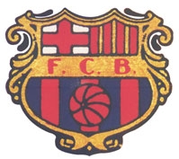
Since 1910, the changes made to the design have been minimal, generally just modifying the
aesthetics and the patterns used for the outline. The biggest changes came about as a result of
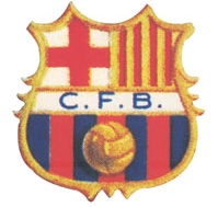
political obligations. When Franco came to power, the letters FCB were replaced by CFB, to reflect
the way the club was forced to use the Spanish version of its name. The dictatorship also obliged
the club to remove two of the four bars from one of the upper quarters, thus excluding the Catalan
flag from the crest. On occasion of the club’s 50th anniversary in 1949, the four bars
returned. The original letters were not recovered until late 1974, when the crest reverted to the
original 1910 design.
The present crest is based on an adaptation made by designer Claret Serrahima in 2002, in
which the lines are a little more stylised, the dots between the letters have been taken away, the
name has been made smaller, and there are fewer pointed edges. The lines in this latest design are
somewhat simpler, to make it easier for the crest and the club’s corporate identity to be
reproduced in all the different formats.
FC Barcelona History
More than a Club
Corporate information
Official sponsors
Copyright - FCBarcelona | Legal Terms | Buy tickets FC Barcelona | This is the FC Barcelona official website